The psychology of colour can have an incredible impact on how visitors perceive your blog, so it’s necessary to understand the colours you’d like to use in your design. While there are significant ways that each colour can make a person feel, there’s also importance in understanding how they interact with each other on screen.
You might think your favourite colours automatically work well together in the same theme, but this is not always the case. Thanks to the science of colour theory, you can learn which colours complement each other, allowing your blog’s design to appear more harmonious and professional than if you’d picked the colours without research.
It’s likely that you’ll have come across the theory at least once before, and if you ever studied Art or Physics, you’ll have no doubt touched on the topic in class. The theory has a wide range of definitions that cover a variety of concepts, so it’s easy to do plenty of research; but with such a wealth of information to be found on the web, it’s also easy to get carried away, like I almost did when writing this post!
The Colour Wheel
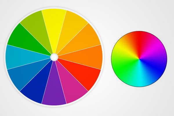
One of the most popular (and most simple) ways to understand the study of colour is through the colour wheel. You can see two variations of the colour wheel depicted above, featured in these 7 facts for understanding colour theory.
Sir Isaac Newton has been credited with producing the first circular diagram of colour as early as 1666, and it’s since been developed by a great number of scientists, artists and designers, with developments in technology allowing for incredible precision when colour matching. This is one of my favourite things about the subject – it bridges so many gaps between science and art! It should also be noted that different devices display colour differently (this is called the ‘gamut’), so the appearance of your blog can change, depending on which screen you’re using.
Colour Harmonies (or Schemes)
The colour wheel allows you to match colours with each other and find the most attractive combination, depending on the relationships that they share. These relationships are depicted brilliantly in this infographic by KISSmetrics, and I’ve borrowed a snippet below to show you an introduction to how colours can harmonise (click through for the full infographic).
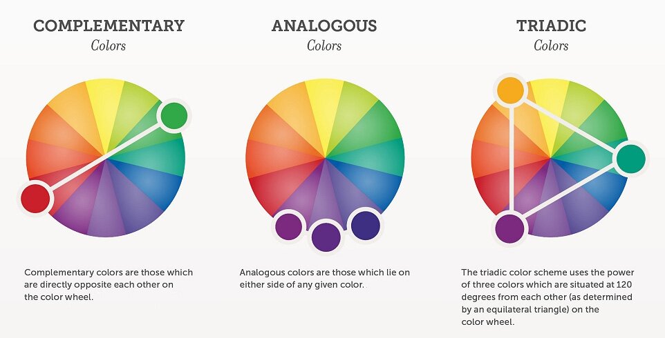
The most basic combinations are that of Complimentary, Analogous and Triadic. By designing your blog using each of these structures, you can come up with a simple colour scheme that’s easy to implement. If you’re feeling adventurous, you can investigate the more complicated Split Complimentary, Rectangular/Tetradic or Square colour schemes, but these are more difficult to harmonise and should be used with care when aiming for a pleasant appearance.
Colour Matching Tools
Giving ‘Colour Theory Tools’ a quick Google, you can find plenty of tools and resources to help you with colour matching, such as this Color Scheme Designer. I’ve found it to be a great interactive way of discovering colours that work well together, and it includes options to adjust each scheme combination.
Once you’ve found the colours that work for you, copy and paste the HTML colour codes allow you to identify the specific hue, so you can then input this it when styling your blog. Speaking of HTML codes, if you have an image that you’d like to style your blog around, you can also use the Colour Extract Tool to break down the image into its component colours.
Hopefully, you’ll now have an insight into how colour theory can help you when designing your blog, a feature that’s overlooked by so many people, but one which can have as much of an effect on user experience as poorly written content and slow loading pages!
Do you have any advice for styling your blog? Let us know in the comments below, and if you love colour as much as we do, head over to our dedicated colour Pinterest board for a multitude of indulgent images!
Amazing post, so interesting! Thanks for sharing. I like blogs that are easy to read, with big font and neat.
Jasmine x
For a Real Woman
So easy Spanish!
Hi Jasmine, thanks for your comment and thanks for the style tip! Big fonts definitely work well!