
Recently we’ve had some amazing articles on some really interesting subjects on how to design your blog, so I thought I would try and join in, and think about how to use fonts on your blog. Obviously, this is all subjective and each blogger will prefer a different typeface or style- but there are some ‘guidelines’ about where they should go, and what they go with.
First, the basics- what are the font families? Sans and Sans Serifs are the most commonly used fonts in the typography world. Serifs are the little dashes you find on letters- for example, in Minion Pro:
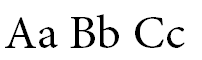
Sans Serif fonts are ones which don’t feature Serif’s- for example, Myriad Pro.
![]()
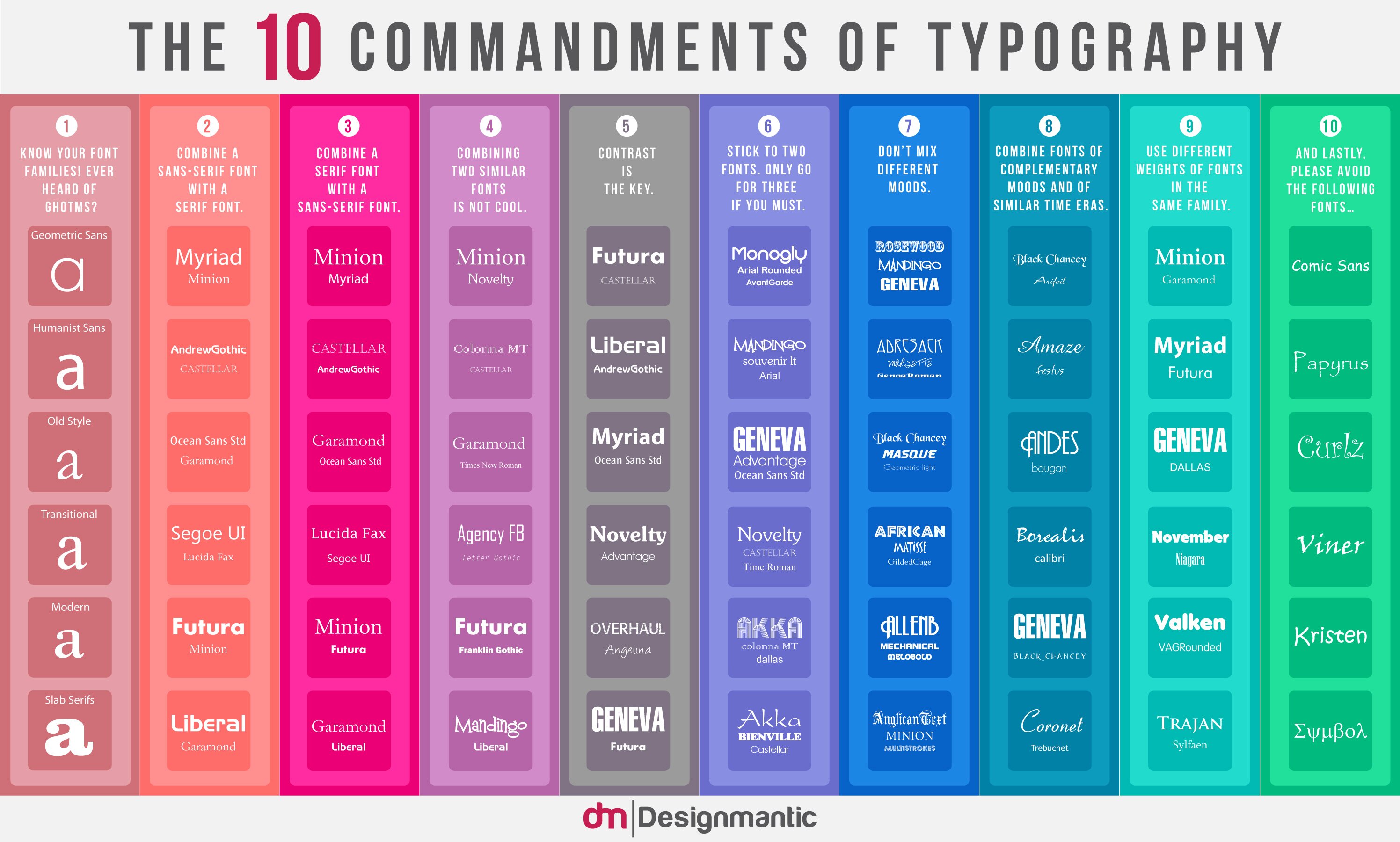
These fonts work really well when used together. For some great font tips, make sure you always refer to the 10 Commandments of Typography. Try not to combine similar looking fonts, it will distract the reader from the text, as they will stop to see if the fonts are the same.
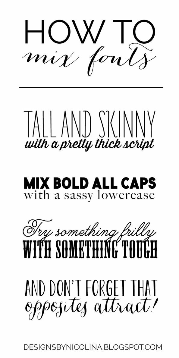
We found this on Pinterest from Designs By Nicolina, and I think it might be one of my favourite ‘How To’ font boards – it very simply tells you how to use different fonts together, and gave me some great ideas! Also, don’t forget to check out our Fabulous Fonts board on Pinterest.
Fonts aren’t just there to look pretty, and to make the text legible. They play a huge influence in how we read text, and our reaction to it. A survey recently said that if a notice was written in Comic Sans, people were less likely to believe it. You want the typeface you use to match the feel of your blog, as a bit of a typeface geek, here are two of my favourite fonts used by bloggers.
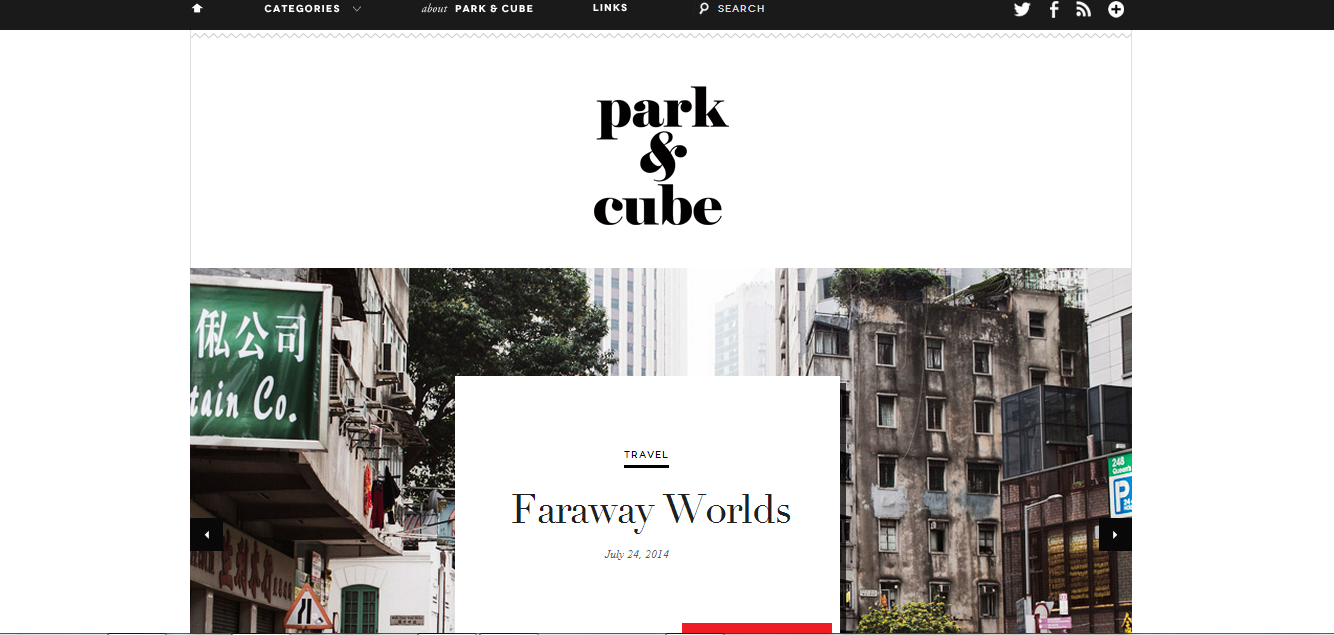
Park & Cube has used different styles of fonts on her homepage, Sans Serifs, Serifs and Italics. The effect isn’t overwhelming as the words are spaced out quite far apart, and despite being different fonts, all complement each other- the weight, matching colour and style balances everything out.
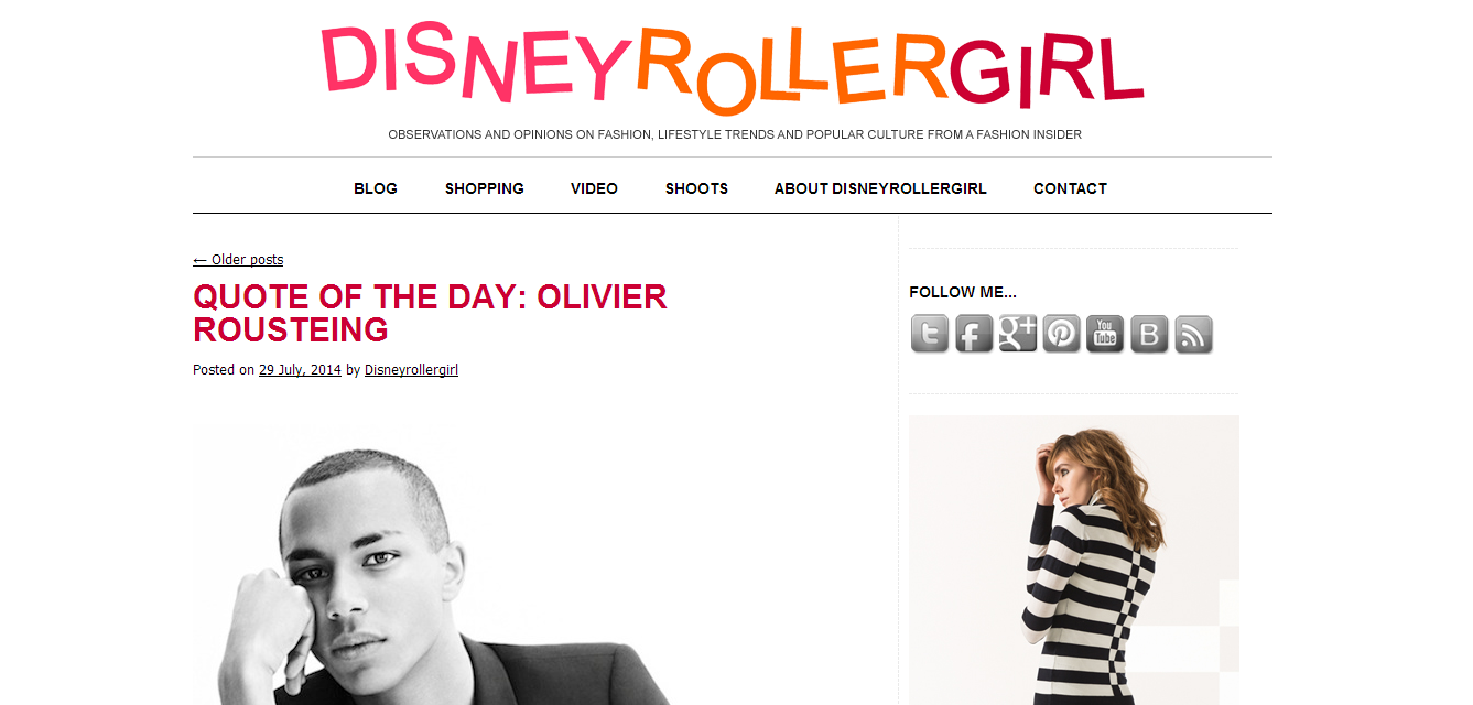
Disney Roller Girl has a very fun style- and very different to Park & Cube. The fonts she uses aren’t dramatically different, but by creating a title with the letters not in a straight row, and using bright colours, she has made a very simple Sans Serif font look really unique and individual. Another aspect of Disney Roller Girl’s typeface that I love is that she didn’t try to use the Disney font, or something similar. By using a simple, Helvetica style font she hasn’t taken focus away from her content.
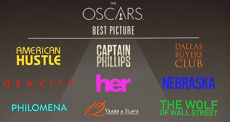
Just to show you what it looks like when too many fonts are used together (and colours which don’t compliment) this is the official board from the 2014 Best Picture at the Oscars. All these fonts look fantastic on their own, but altogether…. Not so much.
For a second, let’s steer away from blogs, and to the fancy world of band logos… I’ve selected three bands below who do very different music, and whose typography is very important to which audience they are trying to attract-this is something that is really useful for your blog.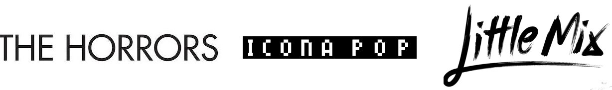
The font Little Mix have used looks handwritten- their audience are mostly teenage girls, so this is well suited to them- also notice the little hearts above the i’s. Icona Pop’s music is very loud electro pop, so their 8-bit style font is a very trendy throw back to the 80s and early 90s. At the moment I am a very big fan of the straight, sans serif fonts, so The Horrors is calling out to me- it’s very simple, and the use of all upper case letters means that it is making a statement, and looks more iconic.
I hope that this has been helpful in showing you the best ways to use font, and how if you follow some very simple guidelines (I don’t think you can really have rules in design) on how to use fonts, then you can instantly make your blog look much more slick and professional- and show potential brands that you know and understand your audience.
No comments yet.