
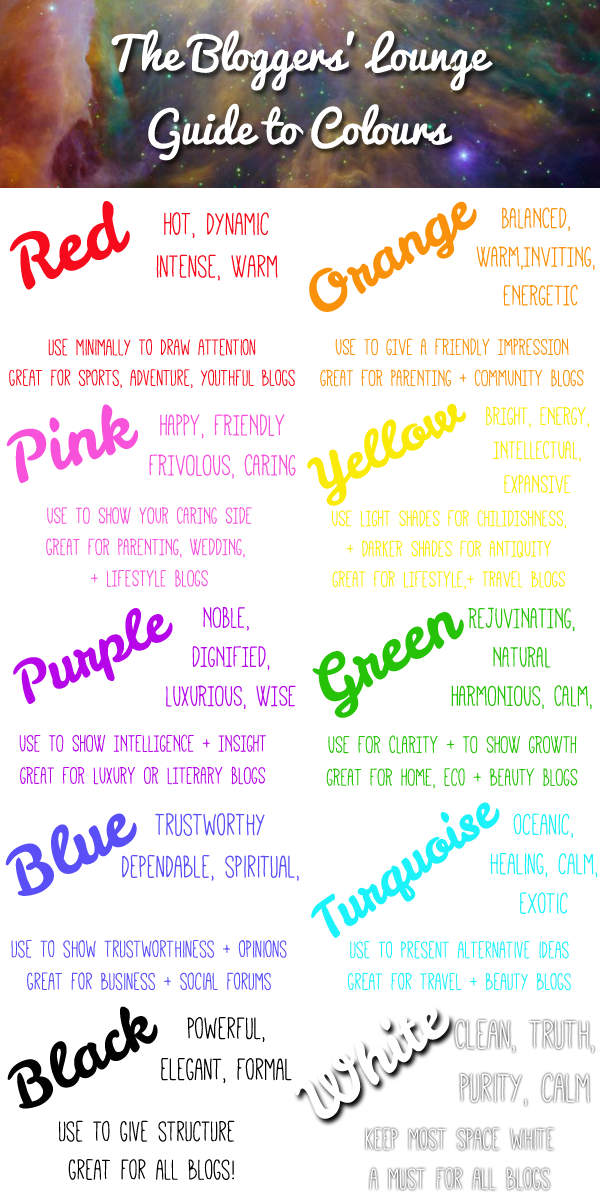
Part of the fun about blogging is indulging in loads of funky designs, layouts, fonts, and colours. However, if you try and put everything but the kitchen sink on your home page, you run the risk of confusing your reader and detracting from your content. Businesses have been using colour psychology for years. Social media, such as Facebook is predominantly blue, fast food is usually labelled red, and gas companies often green. There is a reason behind their choices: to send a subliminal message to their consumers. Bloggers, you should definitely take note of the what colours you are using in your blog, especially in relation to your genre and specific content. Take a look at our Bloggers’ Lounge Colour Guide for some handy tips:
We hope this cleared a few of your colour conundrums up! Obviously, you don’t have to be completely prescriptive with this colour advice. It’s your blog, and some nice graphics, GIFs, and geometric shapes will always go down a treat. Just think when and where a certain colour might come in handy, either for a singular post, or your whole blog theme!
Did you find this colour advice handy? Or do you think colour psychology makes no sense? Feedback is always welcome ![]()
Oh this post brings back memories – I did a study of the use of colour on the internet for my degree dissertation back in 2000… made some very similar recommendations to this so I’m pleased I got some things right! It is a good idea to use the right sort of colour for certain types of blogs/posts, it helps give the reader visual cues as to what you are about before they read any words.
That’s so true Zoe! Use too much of red, and you might scare people off; not enough white space and you’ll confuse the reader. This is just a basic overview of colour, but check out Pinterest for loads of great colour tips! x